public class Tabs
ImplementsAnimation, Editable, Iterable<Component>, StyleListener
A component that lets the user switch between a group of components by clicking on a tab with a given title and/or icon.
Tabs/components are added to a Tabs object by using the
addTab and insertTab methods.
A tab is represented by an index corresponding
to the position it was added in, where the first tab has an index equal to 0
and the last tab has an index equal to the tab count minus 1.
The Tabs uses a SingleSelectionModel
to represent the set of tab indices and the currently selected index.
If the tab count is greater than 0, then there will always be a selected
index, which by default will be initialized to the first tab.
If the tab count is 0, then the selected index will be -1.
A simple Tabs sample looks a bit like this:
Form hi = new Form("Tabs", new BorderLayout());

Tabs t = new Tabs();
Style s = UIManager.getInstance().getComponentStyle("Tab");
FontImage icon1 = FontImage.createMaterial(FontImage.MATERIAL_QUESTION_ANSWER, s);

Container container1 = BoxLayout.encloseY(new Label("Label1"), new Label("Label2"));
t.addTab("Tab1", icon1, container1);
t.addTab("Tab2", new SpanLabel("Some text directly in the tab"));

hi.add(BorderLayout.CENTER, t);
The Tabs allows swiping on the X-axis (by default) but also on the Y-axis:
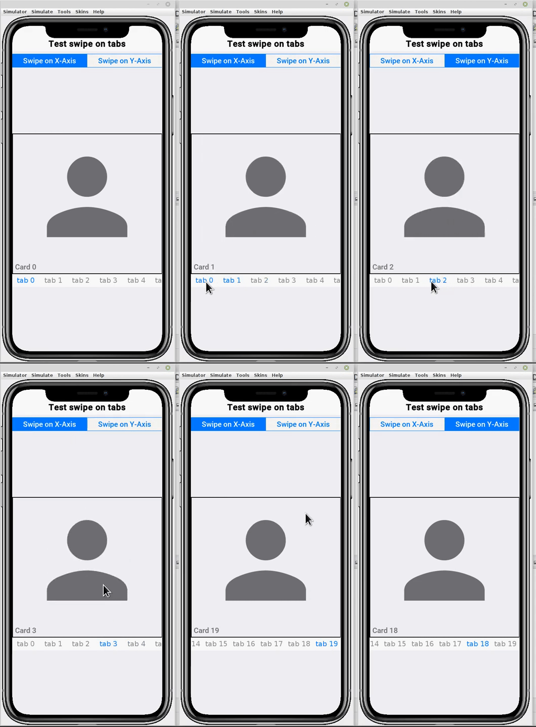
Form hi = new Form("Test swipe on tabs", BorderLayout.absolute());
Tabs tabs = new Tabs();
tabs.addTab("First", new Label("First tab"));
tabs.addTab("Second", new Label("Second tab"));

ButtonGroup btnGroup = new ButtonGroup();
RadioButton swipeXBtn = RadioButton.createToggle("Swipe on X-Axis", btnGroup);
RadioButton swipeYBtn = RadioButton.createToggle("Swipe on Y-Axis", btnGroup);
btnGroup.setSelected(swipeXBtn);

swipeXBtn.addActionListener(l -> tabs.setSwipeOnXAxis(true));
swipeYBtn.addActionListener(l -> tabs.setSwipeOnXAxis(false));

hi.add(BorderLayout.NORTH, GridLayout.encloseIn(2, swipeXBtn, swipeYBtn));
hi.add(BorderLayout.CENTER, tabs);
Constructors
public Tabs() | Creates an empty TabbedPane with a default tab placement of Component.TOP. |
public Tabs(int tabP) | Creates an empty TabbedPane with the specified tab placement of either: Component.TOP, Component.BOTTOM, Component.LEFT, or Component.RIGHT. |
Methods
protected boolean shouldBlockSideSwipe() | A component that might need side swipe such as the slider could block it from being used for some other purpose when on top of said component. |
protected void initLaf(UIManager manager) | This method initializes the Component defaults constants |
public void refreshTheme(boolean merge) | Makes sure the component is up to date with the current theme, ONLY INVOKE THIS METHOD IF YOU CHANGED THE THEME! |
protected void deinitialize() | Invoked to indicate that the component initialization is being reversed since the component was detached from the container hierarchy. |
protected void initComponent() | Allows subclasses to bind functionality that relies on fully initialized and “ready for action” component state |
public boolean animate() | Allows the animation to reduce “repaint” calls when it returns false. |
protected void setTextPosition(Component tabComponent, int textPosition) | Invokes set text position on the given tab, the tab should be a toggle button radio by default but can be anything |
public int getTabTextPosition() | Returns The position of the text relative to the icon |
public void setTabTextPosition(int textPosition) | Sets the position of the text relative to the icon if exists |
public void addTab(String title, Image icon, Component component) | Adds a component represented by a title and/or icon, either of which can be null. |
public Tabs addTab(String title, Image icon, Image pressedIcon, Component component) | Adds a component represented by a title and/or icon, either of which can be null. |
public Tabs addTab(String title, char materialIcon, float iconSize, Component component) | Adds a component represented by a title and/or icon, either of which can be null. |
public Tabs addTab(String title, char icon, Font font, float iconSize, Component component) | Adds a component represented by a title and/or icon, either of which can be null. |
public void addTab(String title, Component component) | Adds a component represented by a title and no icon. |
public void addTab(Button tab, Component component) | Deprecated Adds a component represented by a button. |
protected Component createTab(String title, Font font, char icon, float size) | Creates a tab component by default this is a RadioButton but subclasses can use this to return anything |
protected Component createTab(String title, Image icon) | Creates a tab component by default this is a RadioButton but subclasses can use this to return anything |
public void insertTab(String title, Image icon, Component component, int index) | Inserts a component, at index, represented by a title and/or icon, either of which may be null. |
public void insertTab(String title, char icon, Font font, float iconSize, Component component, int index) | Inserts a component, at index, represented by a title and/or icon, either of which may be null. |
public void insertTab(Component tab, Component component, int index) | Deprecated Inserts a component, at index, represented by a button Uses java.util.Vector internally, see insertElementAt for details of insertion conventions. |
protected void bindTabActionListener(Component tab, ActionListener l) | Binds an action listener to the tab component. |
public void setTabTitle(String title, Image icon, int index) | Updates the information about the tab details |
protected void setTabTitle(Component tab, String title, Image icon) | Updates the tabs title . This method should be used when overriding createTab |
public String getTabTitle(int index) | Returns the title of the tab at the given index |
protected String getTabTitle(Component tab) | Returns the title of the tab component. |
protected Image getTabIcon(Component tab) | Returns the icon of the tab component. |
public Image getTabIcon(int index) | Returns the icon of the tab at the given index |
protected Image getTabSelectedIcon(Component tab) | Returns the selected icon of the tab component. |
public Image getTabSelectedIcon(int index) | Returns the icon of the tab at the given index |
public void setTabSelectedIcon(int index, Image icon) | Sets the selected icon of the tab at the given index |
protected void setTabSelectedIcon(Component tab, Image icon) | Sets the selected icon of the tab. |
public void removeTabAt(int index) | Removes the tab at index. |
public Component getTabComponentAt(int index) | Returns the tab at index. |
public int indexOfComponent(Component component) | Returns the index of the tab for the specified component. |
public int getTabCount() | Returns the number of tabs in this tabbedpane. |
public int getSelectedIndex() | Returns the currently selected index for this tabbedpane. |
public void setSelectedIndex(int index) | Sets the selected index for this tabbedpane. |
public Component getSelectedComponent() | Returns the component associated with the tab at the given index |
public void addTabsFocusListener(FocusListener listener) | Deprecated Adds a focus listener to the tabs buttons |
public void removeTabsFocusListener(FocusListener listener) | Deprecated Removes a foucs Listener from the tabs buttons |
public void addSelectionListener(SelectionListener listener) | Adds a selection listener to the tabs. |
public void removeSelectionListener(SelectionListener listener) | Removes a selection Listener from the tabs |
public String toString() | Overriden to return a useful value for debugging purposes |
public int getTabPlacement() | Returns the placement of the tabs for this tabbedpane. |
public void setTabPlacement(int tabPlacement) | Sets the tab placement for this tabbedpane. |
public Container getContentPane() | This method retrieves the Tabs content pane |
public Container getTabsContainer() | This method retrieves the Tabs buttons Container |
public void setSelectedIndex(int index, boolean slideToSelected) | Sets the currently selected index in the tabs component |
protected void selectTab(Component tab) | Invoked to select a specific tab, this method should be overriden for subclasses overriding createTab |
public void setAnimatedIndicator(boolean enable) | Enables the Material 3 sliding-underline indicator (off by default). |
public boolean isAnimatedIndicator() | Returns whether the animated tab indicator is enabled. |
public void setAnimatedIndicatorDuration(int durationMs) | Duration in milliseconds of the selection morph – both the Material underline tween and the iOS 26 Liquid Glass selection-capsule spring. |
public int getAnimatedIndicatorDuration() | Returns the selection-morph duration in milliseconds. |
public void setMorphTestState(int fromIndex, int toIndex, int value) | TEST-ONLY hook: render the selection morph frozen at a fixed progress (value 0..120, where 100 is the target and >100 is the settle overshoot) travelling from fromIndex to toIndex, so a JavaSE probe can capture exact frames of the animation without racing the real-time motion. |
public void hideTabs() | Hide the tabs bar |
public void showTabs() | Show the tabs bar if it was hidden |
public boolean isSwipeActivated() | Returns true if the swipe between tabs is activated, this is relevant for touch devices only |
public void setSwipeActivated(boolean swipeActivated) | Setter method for swipe mode |
public boolean isChangeTabOnFocus() | Indicates that a tab should change when the focus changes without the user physically pressing a button |
public void setChangeTabOnFocus(boolean changeTabOnFocus) | Indicates that a tab should change when the focus changes without the user physically pressing a button |
public boolean isChangeTabContainerStyleOnFocus() | Indicates that the tabs container should have its style changed to the selected style when one of the tabs has focus this allows incorporating it into the theme of the application |
public void setChangeTabContainerStyleOnFocus(boolean changeTabContainerStyleOnFocus) | Indicates that the tabs container should have its style changed to the selected style when one of the tabs has focus this allows incorporating it into the theme of the application |
public void setTabsContentGap(int tabsGap) | This method allows setting the Tabs content pane spacing (right and left), This can be used to create an effect where the selected tab is smaller and the right and left tabs are visible on the sides |
public String getTabUIID() | The UIID for a tab component which defaults to Tab |
public void setTabUIID(String tabUIID) | The UIID for a tab button which defaults to Tab. |
public boolean isEagerSwipeMode() | Allows marking tabs as swipe “eager” which instantly triggers swipe on movement rather than threshold the swipe. |
public void setEagerSwipeMode(boolean eagerSwipeMode) | Allows marking tabs as swipe “eager” which instantly triggers swipe on movement rather than threshold the swipe. |
public boolean isAnimateTabSelection() | Indicates whether clicking on a tab button should result in an animation to the selected tab or an immediate switch |
public void setAnimateTabSelection(boolean animateTabSelection) | Indicates whether clicking on a tab button should result in an animation to the selected tab or an immediate switch |
protected Motion createTabSlideMotion(int start, int end) | Allows developers to customize the motion object for the slide effect to provide a linear slide effect. |
public boolean isSwipeOnXAxis() | Returns true if the swipe is on the X-Axis, false if the swipe is on the Y-Axis. |
public void setSwipeOnXAxis(boolean b) | It defaults to true; you can set it to false for use cases like the one discussed here: [Realize a set of Containers that are browsable with a finger, like a deck of cards](https://new.reddit.com/r/cn1/comments/quq7yo/realize_a_set_of_c… |
public String[] getPropertyNames() | A component may expose mutable property names for a UI designer to manipulate, this API is designed for usage internally by the GUI builder code |
public Class[] getPropertyTypes() | Matches the property names method (see that method for further details). |
public String[] getPropertyTypeNames() | This method is here to workaround an XMLVM array type bug where property types aren’t identified properly, it returns the names of the types using the following type names: String,int,double,long,byte,short,char,String[],String[][],byte[],I… |
public Object getPropertyValue(String name) | Returns the current value of the property name, this method is used by the GUI builder |
public String setPropertyValue(String name, Object value) | Sets a new value to the given property, returns an error message if failed and null if successful. |
Inherited fields
From Component
DEFAULT_CURSOR, CROSSHAIR_CURSOR, TEXT_CURSOR, WAIT_CURSOR, SW_RESIZE_CURSOR, SE_RESIZE_CURSOR, NW_RESIZE_CURSOR, NE_RESIZE_CURSOR, N_RESIZE_CURSOR, S_RESIZE_CURSOR, W_RESIZE_CURSOR, E_RESIZE_CURSOR, HAND_CURSOR, MOVE_CURSOR, DRAG_REGION_NOT_DRAGGABLE, DRAG_REGION_POSSIBLE_DRAG_X, DRAG_REGION_POSSIBLE_DRAG_Y, DRAG_REGION_POSSIBLE_DRAG_XY, DRAG_REGION_LIKELY_DRAG_X, DRAG_REGION_LIKELY_DRAG_Y, DRAG_REGION_LIKELY_DRAG_XY, DRAG_REGION_IMMEDIATELY_DRAG_X, DRAG_REGION_IMMEDIATELY_DRAG_Y, DRAG_REGION_IMMEDIATELY_DRAG_XY, BRB_CONSTANT_ASCENT, BRB_CONSTANT_DESCENT, BRB_CENTER_OFFSET, BRB_OTHER, CENTER, TOP, LEFT, BOTTOM, RIGHT, BASELINE
Inherited methods
From Container
encloseIn, encloseIn, getUIManager, setUIManager, isSurface, add, addAll, add, add, add, add, add, getLeadComponent, setLeadComponent, getLeadParent, keyPressed, keyReleased, getLayout, setLayout, invalidate, setShouldLayout, setShouldCalcPreferredSize, getLayoutWidth, getLayoutHeight, applyRTL, constrainWidthWhenScrollable, constrainHeightWhenScrollable, addComponent, addComponent, addComponent, addComponent, replaceAndWait, replaceAndWait, replace, replaceAndWait, replace, createReplaceTransition, isEnabled, setEnabled, removeComponent, cancelRepaints, flushReplace, removeAll, revalidateWithAnimationSafety, revalidate, revalidateLater, forceRevalidate, clearClientProperties, paint, paintGlass, layoutContainer, isSafeArea, setSafeArea, isSafeAreaRoot, getSafeAreaRoot, setSafeAreaRoot, getComponentCount, getComponentAt, getComponentIndex, contains, scrollComponentToVisible, getClosestComponentTo, getResponderAt, getComponentAt, findDropTargetAt, pointerPressed, calcPreferredSize, paramString, isScrollableX, setScrollableX, isScrollableY, setScrollableY, getSideGap, getBottomGap, setScrollable, setCellRenderer, getScrollIncrement, setScrollIncrement, findFirstFocusable, dragInitiated, fireClicked, isSelectableInteraction, getGridPosY, paintComponentBackground, getGridPosX, animateHierarchyAndWait, createAnimateHierarchy, animateHierarchy, animateHierarchyFadeAndWait, createAnimateHierarchyFade, animateHierarchyFade, animateLayoutFadeAndWait, createAnimateLayoutFadeAndWait, animateLayoutFade, createAnimateLayoutFade, animateLayoutAndWait, animateLayout, updateTabIndices, createAnimateLayout, drop, createAnimateMotion, morph, morphAndWait, animateUnlayout, animateUnlayoutAndWait, createAnimateUnlayout, getChildrenAsList, iterator, iterator
From Component
setSameSize, isSetCursorSupported, parsePreferredSize, getDefaultDragTransparency, setDefaultDragTransparency, getEditingDelegate, setEditingDelegate, getCursor, setCursor, showNativeOverlay, hideNativeOverlay, updateNativeOverlay, getNativeOverlay, getAllStyles, getSameWidth, setSameWidth, getSameHeight, setSameHeight, getX, setX, getOuterX, getInnerX, getY, setY, getOuterY, getInnerY, isVisible, setVisible, getClientProperty, stripMarginAndPadding, putClientProperty, getDirtyRegion, setDirtyRegion, isOpaque, setOpaque, getWidth, setWidth, getOuterWidth, getInnerWidth, getHeight, setHeight, getOuterHeight, getInnerHeight, isDragRegion, getDragRegionStatus, getBaseline, getBaselineResizeBehavior, getPreferredSizeStr, setPreferredSizeStr, getPreferredSize, setPreferredSize, getScrollDimension, calcScrollSize, setScrollSize, getPreferredW, setPreferredW, getPreferredH, setPreferredH, getOuterPreferredH, getInnerPreferredH, getOuterPreferredW, getInnerPreferredW, setSize, getUIID, setUIID, setUIIDFinal, setUIID, getInlineAllStyles, setInlineAllStyles, getInlineSelectedStyles, setInlineSelectedStyles, getInlineUnselectedStyles, setInlineUnselectedStyles, getInlineDisabledStyles, setInlineDisabledStyles, getInlinePressedStyles, setInlinePressedStyles, remove, getParent, getOwner, setOwner, isOwnedBy, containsOrOwns, addFocusListener, removeFocusListener, addScrollListener, removeScrollListener, getSelectCommandText, setSelectCommandText, getLabelForComponent, setLabelForComponent, focusGained, focusLost, paintBackgrounds, paintShadows, getAbsoluteX, getAbsoluteY, isInClippingRegion, paintIntersectingComponentsAbove, paintScrollbars, paintScrollbarX, getScrollOpacity, getSelectedRect, paintScrollbarY, paintComponent, paintComponent, getBorder, getScrollable, paintBackground, isScrollable, getScrollX, setScrollX, getScrollY, setScrollY, onScrollX, onScrollY, getDraggedx, getDraggedy, contains, visibleBoundsContains, hasFixedPreferredSize, getBounds, getBounds, getVisibleBounds, getVisibleBounds, isFocusable, setFocusable, onSetFocusable, resetFocusable, getTabIndex, setTabIndex, getPreferredTabIndex, setPreferredTabIndex, isTraversable, setTraversable, handlesInput, setHandlesInput, consumesRawTextInput, hasFocus, setFocus, getComponentForm, getTopLevelContainer, repaint, repaint, longKeyPress, keyRepeated, registerForAnimation, deregisterFromAnimation, getAnimationManager, getScrollAnimationSpeed, setScrollAnimationSpeed, isBlockLead, setBlockLead, isIgnorePointerEvents, setIgnorePointerEvents, isRippleEffect, setRippleEffect, getInlineStylesTheme, setInlineStylesTheme, shouldRenderComponentSelection, isHideInLandscape, setHideInLandscape, createStyleAnimation, isSmoothScrolling, setSmoothScrolling, pointerHover, stopScrollMomentum, pointerHoverReleased, pointerHoverPressed, pinch, pinchReleased, pinch, rotation, isPinchBlocksDragAndDrop, setPinchBlocksDragAndDrop, pointerDragged, getDragImage, getDragTransparency, setDragTransparency, toImage, drawDraggedImage, draggingOver, dragEnter, dragExit, addPullToRefresh, setPullToRefresh, respondsToPointerEvents, pointerDragged, isStickyDrag, pointerPressed, isDragAndDropOperation, pointerReleased, longPointerPress, pointerReleased, setVerticalScrollBounds, setHorizontalScrollBounds, isVScrollThumbGrabbed, isHScrollThumbGrabbed, isVScrollThumbHover, isHScrollThumbHover, isTensileDragEnabled, setTensileDragEnabled, getTextSelectionSupport, addDropListener, removeDropListener, addDragOverListener, removeDragOverListener, isNativeDragSource, setNativeDragSource, getNativeDragOperation, setNativeDragOperation, createNativeDragOperation, isNativeDropTarget, setNativeDropTarget, getAcceptedDropMimeTypes, setAcceptedDropMimeTypes, getAcceptedDropActions, setAcceptedDropActions, canAcceptNativeDrop, nativeDragEnter, nativeDragOver, nativeDragExit, nativeDrop, addNativeDropListener, removeNativeDropListener, addNativeDragOverListener, removeNativeDragOverListener, dragFinished, addDragFinishedListener, addStateChangeListener, removeStateChangeListener, addPointerPressedListener, addLongPressListener, addContextMenuListener, removeContextMenuListener, addMouseWheelListener, removeMouseWheelListener, addStylusListener, removeStylusListener, mouseWheel, paintRippleOverlay, removePointerPressedListener, removeLongPressListener, removeDragFinishedListener, addPointerReleasedListener, removePointerReleasedListener, addPointerDraggedListener, removePointerDraggedListener, getDragSpeed, getStyle, getPressedStyle, setPressedStyle, initUnselectedStyle, initPressedStyle, initDisabledStyle, initSelectedStyle, getUnselectedStyle, setUnselectedStyle, getSelectedStyle, setSelectedStyle, getDisabledStyle, setDisabledStyle, installDefaultPainter, requestFocus, refreshTheme, refreshTheme, isDragActivated, scrollRectToVisible, scrollRectToVisible, paintBorder, paintBorderBackground, isCellRenderer, isScrollVisible, setScrollVisible, setIsScrollVisible, startEditingAsync, stopEditing, isEditing, isEditable, laidOut, isInitialized, setInitialized, styleChanged, getNextFocusDown, setNextFocusDown, getNextFocusUp, setNextFocusUp, getNextFocusLeft, setNextFocusLeft, getNextFocusRight, setNextFocusRight, getName, setName, initCustomStyle, deinitializeCustomStyle, isRTL, setRTL, isTactileTouch, isTactileTouch, setTactileTouch, paintLockRelease, paintLock, isSnapToGrid, setSnapToGrid, shouldBlockSideSwipeLeft, shouldBlockSideSwipeRight, blocksSideSwipe, isFlatten, setFlatten, getTensileLength, setTensileLength, isGrabsPointerEvents, setGrabsPointerEvents, getScrollOpacityChangeSpeed, setScrollOpacityChangeSpeed, growShrink, isAlwaysTensile, setAlwaysTensile, isDraggable, setDraggable, isDropTarget, setDropTarget, isChildOf, isHideInPortrait, setHideInPortrait, getBindablePropertyNames, getBindablePropertyTypes, bindProperty, unbindProperty, getBoundPropertyValue, setBoundPropertyValue, getCloudBoundProperty, setCloudBoundProperty, getCloudDestinationProperty, setCloudDestinationProperty, getComponentState, setComponentState, setHidden, isHidden, setHidden, isHidden, announceForAccessibility, getAccessibilityText, setAccessibilityText, getSemantics, getAccessibilityNode, accessibilityChanged, accessibilityChanged, getTooltip, setTooltip
Constructor details
Tabs
public Tabs()TabbedPane with a default
tab placement of Component.TOP.Tabs
public Tabs(int tabP)TabbedPane with the specified tab placement
of either: Component.TOP, Component.BOTTOM,
Component.LEFT, or Component.RIGHT.Parameters
tabPint- the placement for the tabs relative to the content
Method details
shouldBlockSideSwipe
protected boolean shouldBlockSideSwipe()initLaf
protected void initLaf(UIManager manager)refreshTheme
public void refreshTheme(boolean merge)Parameters
mergeboolean- indicates if the current styles should be merged with the new styles
deinitialize
protected void deinitialize()initComponent
protected void initComponent()animate
public boolean animate()com.codename1.ui.Display class.Returns
setTextPosition
protected void setTextPosition(Component tabComponent, int textPosition)Parameters
tabComponentComponent- the component representing the tab
textPositionint- the text position
getTabTextPosition
public int getTabTextPosition()Returns
setTabTextPosition
public void setTabTextPosition(int textPosition)Parameters
textPositionint- alignment value (LEFT, RIGHT, BOTTOM or TOP)
addTab
public void addTab(String title, Image icon, Component component)component
represented by a title and/or icon,
either of which can be null.
Cover method for insertTab.Parameters
titleString- the title to be displayed in this tab
iconImage- the icon to be displayed in this tab
componentComponent- the component to be displayed when this tab is clicked
See also
addTab
public Tabs addTab(String title, Image icon, Image pressedIcon, Component component)component
represented by a title and/or icon,
either of which can be null.
Cover method for insertTab.Parameters
titleString- the title to be displayed in this tab
iconImage- the icon to be displayed in this tab
pressedIconImage- the icon shown when the tab is selected
componentComponent- the component to be displayed when this tab is clicked
Returns
See also
addTab
public Tabs addTab(String title, char materialIcon, float iconSize, Component component)component
represented by a title and/or icon,
either of which can be null.
Cover method for insertTab.Parameters
titleString- the title to be displayed in this tab
materialIconchar- one of the material design icon constants from
com.codename1.ui.FontImage iconSizefloat- icon size in millimeters
componentComponent- the component to be displayed when this tab is clicked
Returns
See also
addTab
public Tabs addTab(String title, char icon, Font font, float iconSize, Component component)component
represented by a title and/or icon,
either of which can be null.
Cover method for insertTab.Parameters
titleString- the title to be displayed in this tab
iconchar- an icon from the font
fontFont- the font for the icon
iconSizefloat- icon size in millimeters
componentComponent- the component to be displayed when this tab is clicked
Returns
See also
addTab
public void addTab(String title, Component component)component
represented by a title and no icon.
Cover method for insertTab.Parameters
titleString- the title to be displayed in this tab
componentComponent- the component to be displayed when this tab is clicked
See also
addTab
public void addTab(Button tab, Component component)component
represented by a button.
Cover method for insertTab.
The Button styling will be associated with “Tab” UIID.Parameters
tabButton- represents the tab on top
componentComponent- the component to be displayed when this tab is clicked
See also
createTab
protected Component createTab(String title, Font font, char icon, float size)Parameters
titleString- the title of the tab
fontFont- the font for the icon
iconchar- an icon from the font
sizefloat- Not documented.
Returns
createTab
protected Component createTab(String title, Image icon)Parameters
titleString- the title of the tab
iconImage- the icon of the tab
Returns
insertTab
public void insertTab(String title, Image icon, Component component, int index)component, at index,
represented by a title and/or icon,
either of which may be null.
Uses java.util.Vector internally, see insertElementAt
for details of insertion conventions.Parameters
titleString- the title to be displayed in this tab
iconImage- the icon to be displayed in this tab
componentComponent- The component to be displayed when this tab is clicked.
indexint- the position to insert this new tab
See also
insertTab
public void insertTab(String title, char icon, Font font, float iconSize, Component component, int index)component, at index,
represented by a title and/or icon,
either of which may be null.
Uses java.util.Vector internally, see insertElementAt
for details of insertion conventions.Parameters
titleString- the title to be displayed in this tab
iconchar- an icon from the font
fontFont- the font for the icon
iconSizefloat- Not documented.
componentComponent- The component to be displayed when this tab is clicked.
indexint- the position to insert this new tab
See also
insertTab
public void insertTab(Component tab, Component component, int index)component, at index,
represented by a button
Uses java.util.Vector internally, see insertElementAt
for details of insertion conventions.
The Button styling will be associated with “Tab” UIID.Parameters
tabComponent- represents the tab on top
componentComponent- The component to be displayed when this tab is clicked.
indexint- the position to insert this new tab
See also
bindTabActionListener
protected void bindTabActionListener(Component tab, ActionListener l)Parameters
tabComponent- the tab component
lActionListener- the listener
setTabTitle
public void setTabTitle(String title, Image icon, int index)Parameters
titleString- the title to be displayed in this tab
iconImage- the icon to be displayed in this tab
indexint- the position to insert this new tab
setTabTitle
protected void setTabTitle(Component tab, String title, Image icon)Parameters
tabComponent- the tab component
titleString- the title
iconImage- the new icon
getTabTitle
public String getTabTitle(int index)Parameters
indexint- index for the tab
Returns
getTabTitle
protected String getTabTitle(Component tab)Parameters
tabComponent- the tab component
Returns
getTabIcon
protected Image getTabIcon(Component tab)Parameters
tabComponent- the tab component
Returns
getTabIcon
public Image getTabIcon(int index)Parameters
indexint- index for the tab
Returns
getTabSelectedIcon
protected Image getTabSelectedIcon(Component tab)Parameters
tabComponent- the tab component
Returns
getTabSelectedIcon
public Image getTabSelectedIcon(int index)Parameters
indexint- index for the tab
Returns
setTabSelectedIcon
public void setTabSelectedIcon(int index, Image icon)Parameters
indexint- index for the tab
iconImage- of the tab at the given index
setTabSelectedIcon
protected void setTabSelectedIcon(Component tab, Image icon)Parameters
tabComponent- the tab component
iconImage- of the tab
removeTabAt
public void removeTabAt(int index)index.
After the component associated with index is removed,
its visibility is reset to true to ensure it will be visible
if added to other containers.Parameters
indexint- the index of the tab to be removed
Throws
IndexOutOfBoundsException- if index is out of range (index = tab count)
See also
getTabComponentAt
public Component getTabComponentAt(int index)index.Parameters
indexint- the index of the tab to be removed
Returns
Throws
IndexOutOfBoundsException- if index is out of range (index = tab count)
See also
indexOfComponent
public int indexOfComponent(Component component)Parameters
componentComponent- the component for the tab
Returns
getTabCount
public int getTabCount()tabbedpane.Returns
getSelectedIndex
public int getSelectedIndex()Returns
setSelectedIndex
public void setSelectedIndex(int index)Parameters
indexint- the index to be selected
Throws
IndexOutOfBoundsException- if index is out of range (index = tab count)
getSelectedComponent
public Component getSelectedComponent()Returns
addTabsFocusListener
public void addTabsFocusListener(FocusListener listener)Parameters
listenerFocusListener- FocusListener
removeTabsFocusListener
public void removeTabsFocusListener(FocusListener listener)Parameters
listenerFocusListener- FocusListener
addSelectionListener
public void addSelectionListener(SelectionListener listener)Parameters
listenerSelectionListener- SelectionListener
removeSelectionListener
public void removeSelectionListener(SelectionListener listener)Parameters
listenerSelectionListener- SelectionListener
toString
public String toString()Returns
getTabPlacement
public int getTabPlacement()Returns
See also
setTabPlacement
public void setTabPlacement(int tabPlacement)Sets the tab placement for this tabbedpane. Possible values are:
Component.TOPComponent.BOTTOMComponent.LEFTComponent.RIGHT
The default value, if not set, is Component.TOP.
Parameters
tabPlacementint- the placement for the tabs relative to the content
getContentPane
public Container getContentPane()Returns
getTabsContainer
public Container getTabsContainer()Returns
setSelectedIndex
public void setSelectedIndex(int index, boolean slideToSelected)Parameters
indexint- the index for the tab starting with tab 0.
slideToSelectedboolean- true to animate the transition to the new selection false to just move immediately
selectTab
protected void selectTab(Component tab)Parameters
tabComponent- the tab
setAnimatedIndicator
public void setAnimatedIndicator(boolean enable)Enables the Material 3 sliding-underline indicator (off by default).
When on, selection changes tween the indicator from the old tab’s
bounds to the new tab’s bounds over tabsAnimatedIndicatorDurationInt
milliseconds (default 200, ease-in-out cubic).
Color is taken from the TabIndicator UIID’s foreground color when
it exists, otherwise from the currently-selected tab’s foreground color.
Thickness is 1mm; override with the tabsAnimatedIndicatorThicknessMm
theme constant (in millimeters).
isAnimatedIndicator
public boolean isAnimatedIndicator()#setAnimatedIndicator(boolean).setAnimatedIndicatorDuration
public void setAnimatedIndicatorDuration(int durationMs)tabsAnimatedIndicatorDurationInt theme constant.getAnimatedIndicatorDuration
public int getAnimatedIndicatorDuration()#setAnimatedIndicatorDuration(int).setMorphTestState
public void setMorphTestState(int fromIndex, int toIndex, int value)value 0..120, where 100 is the target and >100 is the settle overshoot)
travelling from fromIndex to toIndex, so a JavaSE probe can capture exact
frames of the animation without racing the real-time motion. Pass value < 0
to clear and resume normal behaviour.hideTabs
public void hideTabs()showTabs
public void showTabs()isSwipeActivated
public boolean isSwipeActivated()Returns
setSwipeActivated
public void setSwipeActivated(boolean swipeActivated)isChangeTabOnFocus
public boolean isChangeTabOnFocus()Returns
setChangeTabOnFocus
public void setChangeTabOnFocus(boolean changeTabOnFocus)Parameters
changeTabOnFocusboolean- the changeTabOnFocus to set
isChangeTabContainerStyleOnFocus
public boolean isChangeTabContainerStyleOnFocus()Returns
setChangeTabContainerStyleOnFocus
public void setChangeTabContainerStyleOnFocus(boolean changeTabContainerStyleOnFocus)Parameters
changeTabContainerStyleOnFocusboolean- the changeTabContainerStyleOnFocus to set
setTabsContentGap
public void setTabsContentGap(int tabsGap)Parameters
tabsGapint- the gap on the sides of the content in pixels, the value must be positive.
getTabUIID
public String getTabUIID()Returns
setTabUIID
public void setTabUIID(String tabUIID)The UIID for a tab button which defaults to Tab.
Tab buttons used to have two separate styles for selected and unselected. This was later consolidated so
the tabs behave as a single toggle button (radio button) however one thing that remained is a call to
setUIID that is implicitly made to restore the original “Tab” style.
Effectively Tabs invokes the setUIID call on the Tab switch so if you want to manipulate
the tab UIID manually (have one red and one green tab) this is a problem..
To enable such code add all the tabs then just just invoke setTabUIID(null) to disable
this behavior.
Parameters
tabUIIDString- the tabUIID to set
isEagerSwipeMode
public boolean isEagerSwipeMode()Returns
setEagerSwipeMode
public void setEagerSwipeMode(boolean eagerSwipeMode)Parameters
eagerSwipeModeboolean- the eagerSwipeMode to set
isAnimateTabSelection
public boolean isAnimateTabSelection()Returns
setAnimateTabSelection
public void setAnimateTabSelection(boolean animateTabSelection)Parameters
animateTabSelectionboolean- the animateTabSelection to set
createTabSlideMotion
protected Motion createTabSlideMotion(int start, int end)tabsSlideSpeedInt
theme constant to define the time in milliseconds between releasing the swiped
tab and reaching the next tab. This currently defaults to 200.Parameters
startint- start position
endint- end position for the motion
Returns
isSwipeOnXAxis
public boolean isSwipeOnXAxis()true if the swipe is on the X-Axis, false if the swipe is on the Y-Axis.Returns
setSwipeOnXAxis
public void setSwipeOnXAxis(boolean b)It defaults to true; you can set it to false for use cases like the
one discussed here:
Realize a set of Containers that are browsable with a finger, like a deck of cards
Example of usage (demo video):
Form hi = new Form("Test swipe on tabs", BorderLayout.absolute());
Tabs tabs = new Tabs();
ButtonGroup btnGroup = new ButtonGroup();
Button swipeXBtn = RadioButton.createToggle("Swipe on X-Axis", btnGroup);
Button swipeYBtn = RadioButton.createToggle("Swipe on Y-Axis", btnGroup);
btnGroup.setSelected(0);

swipeXBtn.addActionListener(l -> {
    tabs.setSwipeOnXAxis(true);
});

swipeYBtn.addActionListener(l -> {
    tabs.setSwipeOnXAxis(false);
});

hi.add(BorderLayout.NORTH, GridLayout.encloseIn(2, swipeXBtn, swipeYBtn));

//tabs.hideTabs();
hi.add(BorderLayout.CENTER, tabs);

List cards = new ArrayList<>();
for (int i=0; i<20; i++) {
    Container card = new Container(BoxLayout.y());
    card.getAllStyles().setBorder(Border.createLineBorder(CN.convertToPixels(1)/5, 0));
    card.addAll(FlowLayout.encloseCenter(new Label(FontImage.createMaterial(FontImage.MATERIAL_PERSON, "Label", 50.0f))), new Label("Card " + i));
    cards.add(card);
    tabs.addTab("tab " + i, card);
}

hi.show();
Parameters
bbooleantrueto set the swipe on the X-Axis,falseto set the swipe on the Y-Axis
getPropertyNames
public String[] getPropertyNames()Returns
getPropertyTypes
public Class[] getPropertyTypes()Returns
getPropertyTypeNames
public String[] getPropertyTypeNames()Returns
getPropertyValue
public Object getPropertyValue(String name)Parameters
nameString- the name of the property
Returns
setPropertyValue
public String setPropertyValue(String name, Object value)Parameters
nameString- the name of the property
valueObject- new value for the property